Redesign of corporate identity, 2015
Alu Alprem is provider of building elements from aluminium, which is presented in the market more than 50 years. The tradition and high reputation that the company enjoys, are the reason for the renewal of the corporate image.
Renovation of the existing logo has followed two fundamental objectives: visibility of the company and aesthetics, that is consistent with the times. We retain the symbol, that expresses distinctive identity and we put the name of the company in the spotlight, so you can see it fully and it is easily readable. With this we have created a sense of confidence. According to tradition and good name of the company, we adapted the elements of typography and colours that are far modern and more appropriate for technology related business.
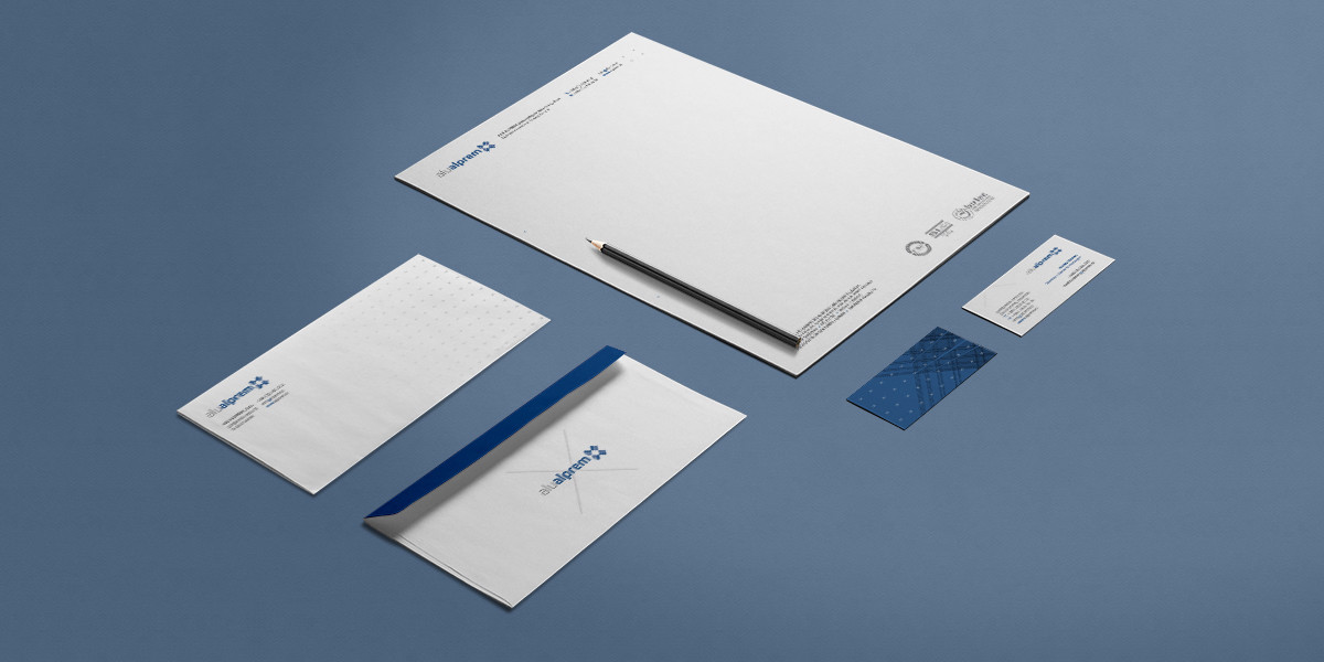
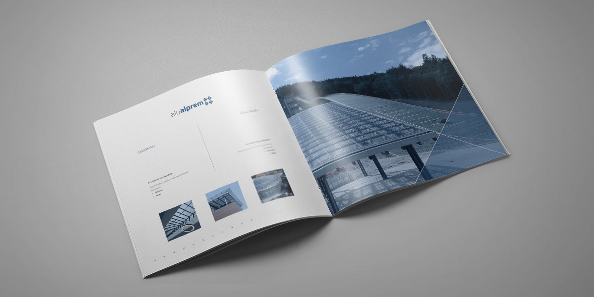
Elements of the renewed corporate identity are applied on through various communication tools such as: business cards, letter, reference list, the presentation brochure.